Client
Client
Client
Artify
Artify
Artify
Services
Services
Services
UI Design
Wireframing
UX Research
UI Design
Wireframing
UX Research
UI Design
Wireframing
UX Research
Tools
Figma
Adobe InDesign
Adobe Illustrator
Tools
Tools
Figma
Adobe InDesign
Adobe Illustrator
Adobe Photoshop
Figma
Adobe InDesign
Adobe Illustrator
Adobe Photoshop
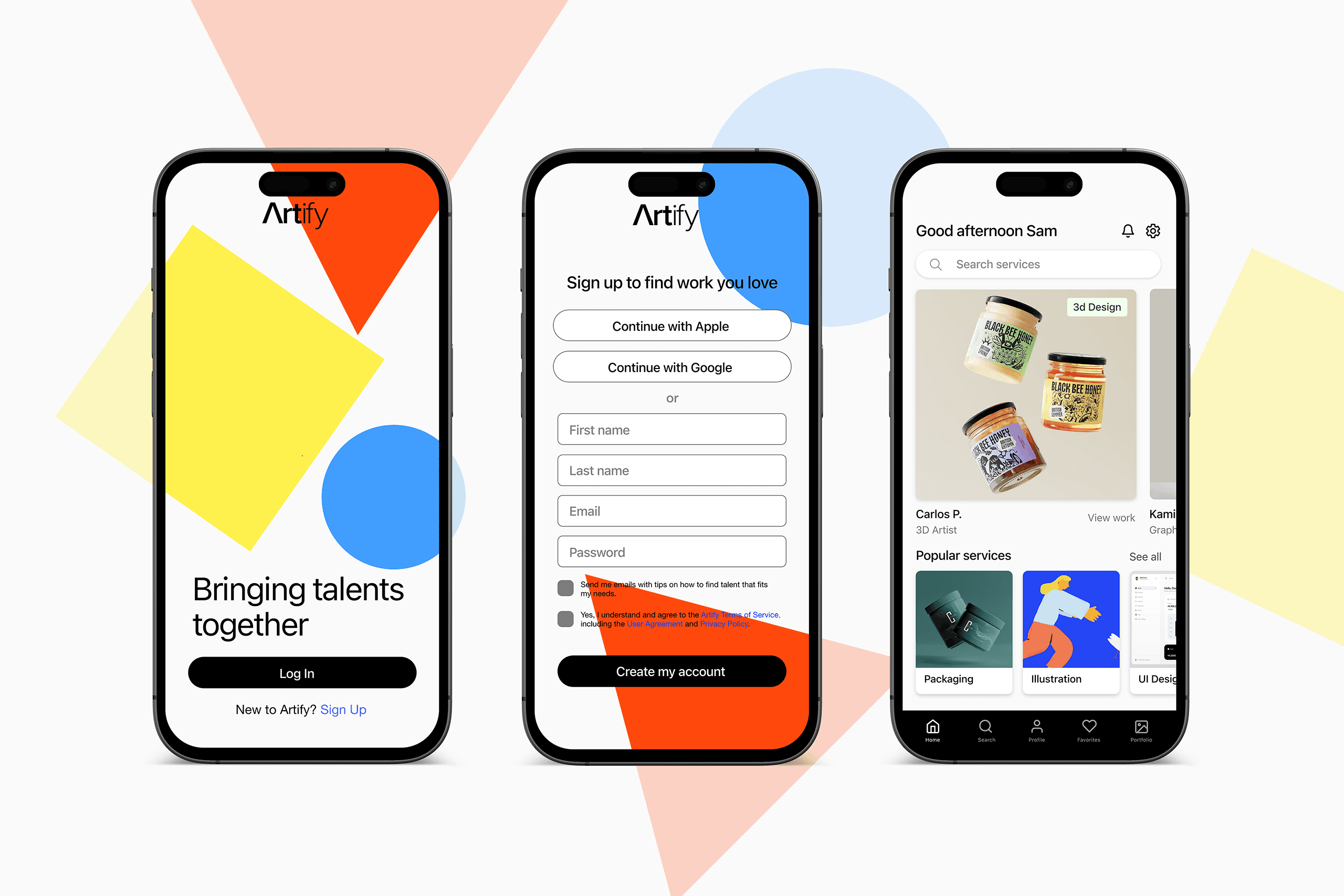
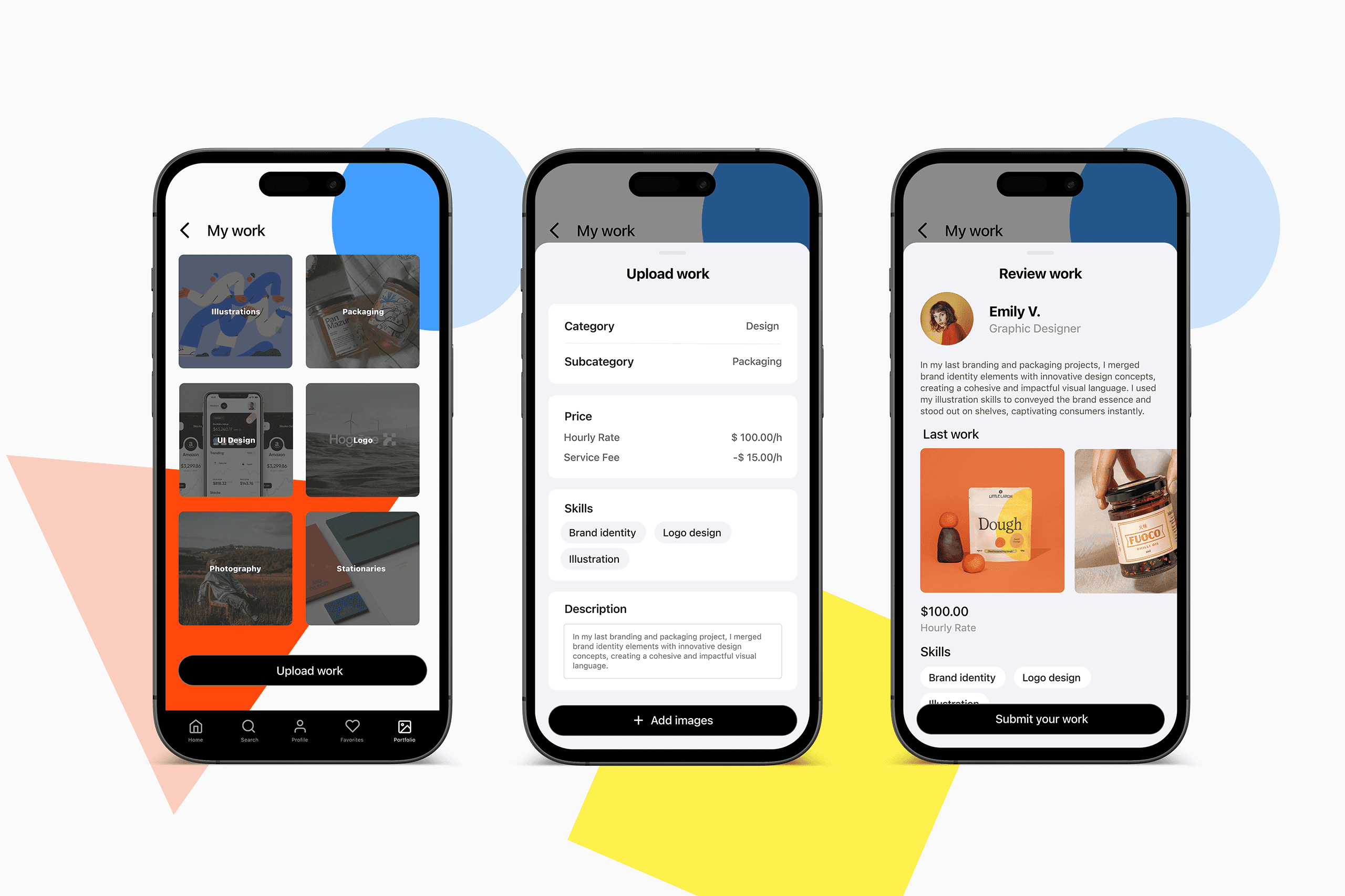
Drawing inspiration from the essence of art and creativity, I revisited the primary colors and shapes that serve as the building blocks of artistic expression. I opted for vibrant hues of Red, Blue, and Yellow, which not only form the basis of all colours but also embody the essence of fun and playfulness inherent in the brand.
In parallel, I carefully selected three corresponding shapes to visually encapsulate Artify's values. The triangle signifies innovation and direction, the square represents strength and reliability, and the circle symbolises an inclusive community. Through these deliberate design choices, Artify is not just a platform, but encourages a vibrant and creative ecosystem.
Details
Details
Details
Artify, a prominent platform facilitating connections between artists and agencies, is embarking on a crucial initiative to enhance usability, address user frustrations, and refresh its overall look and feel through a comprehensive brand and app redesign.
Artify, a prominent platform facilitating connections between artists and agencies, is embarking on a crucial initiative to enhance usability, address user frustrations, and refresh its overall look and feel through a comprehensive brand and app redesign.
Artify, a prominent platform facilitating connections between artists and agencies, is embarking on a crucial initiative to enhance usability, address user frustrations, and refresh its overall look and feel through a comprehensive brand and app redesign.
Drawing inspiration from the essence of art and creativity, I revisited the primary colors and shapes that serve as the building blocks of artistic expression. I opted for vibrant hues of Red, Blue, and Yellow, which not only form the basis of all colours but also embody the essence of fun and playfulness inherent in the brand.
In parallel, I carefully selected three corresponding shapes to visually encapsulate Artify's values. The triangle signifies innovation and direction, the square represents strength and reliability, and the circle symbolises an inclusive community. Through these deliberate design choices, Artify is not just a platform, but encourages a vibrant and creative ecosystem.
Drawing inspiration from the essence of art and creativity, I revisited the primary colors and shapes that serve as the building blocks of artistic expression. I opted for vibrant hues of Red, Blue, and Yellow, which not only form the basis of all colours but also embody the essence of fun and playfulness inherent in the brand.
In parallel, I carefully selected three corresponding shapes to visually encapsulate Artify's values. The triangle signifies innovation and direction, the square represents strength and reliability, and the circle symbolises an inclusive community. Through these deliberate design choices, Artify is not just a platform, but encourages a vibrant and creative ecosystem.
Drawing inspiration from the essence of art and creativity, I revisited the primary colors and shapes that serve as the building blocks of artistic expression. I opted for vibrant hues of Red, Blue, and Yellow, which not only form the basis of all colours but also embody the essence of fun and playfulness inherent in the brand.
In parallel, I carefully selected three corresponding shapes to visually encapsulate Artify's values. The triangle signifies innovation and direction, the square represents strength and reliability, and the circle symbolises an inclusive community. Through these deliberate design choices, Artify is not just a platform, but encourages a vibrant and creative ecosystem.